Website re-design for an ed-tech charity, BitbyBit
One week design sprint introducing the basics of UI Design

Introduction
For the second visual design week I re-designed an existing website from a selection of charities. I chose a charity called BitByBit, an organisation in America that offers low-cost and no-cost tech programs to underprivileged children in High School and Middle School. I chose the charity because I was interested in working on an ed-tech website for students, something that I hadn’t done before.
The Brief
As mentioned, our task was to re-skin one or two pages of the website across three different viewports. We had to keep the functionalities, structure, and content identical, only changing the UI and branding.
UX Skills
Research: Competitor Analysis, Word Association, Moodboard
Visual Design: Sketching, Lo, Mid and Hi-Fidelity Prototypes
Platforms Used
Figma, Miro, sketchbook,
Research

The Brand
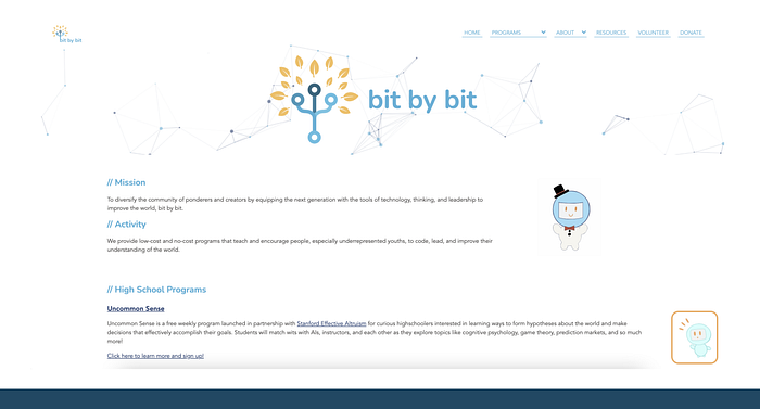
To start the process I took a proper look at the website to identify what pages I wanted to reskin and what keywords I could take into my word association. On first look at the website I actually didn’t think it was too bad, especially compared to the other options that were on offer. There was an interactive shape that moved as your cursor entered the frame adding an element of dynamism. The main issues were;
- Too much text — no differentiation between headers and body text
- Poor content hierarchy
- Colours inaccessible
- No photos of people — For a website that was about education and teaching I was surprised to find that there weren’t any photos featuring people in them
- About page in a separate tab — For a charity set up by two women at University, I wanted to celebrate this by bringing it onto the homepage to show potential investors who had started the brand and to give BitbyBit a personality.
Competitor Analysis
‘Competitor’ analysis seems silly to say in the charity context. I wanted to get a sense of what other charities were doing both in the ed-tech space but also across more general charities in food waste, health etc. Competitors analysis is a great way to get design inspiration for screen layouts, typography and how similar brands are promoting a certain subject.
Educational Charities & Courses:
Girls like Code, Code Academy, Code First Girls, General Assembly, UCL

Key Takeaways
- The images of people make the homepages much more engaging and relatable
- Use of hard/geometric shapes as opposed to soft edges to give a more exciting feel to the website. Contrasting colours also heighten this
- Lots of space between content
- Use of bold, big, exciting text — Find a keyphrase and enlargen it — Changing the perception around coding to make it exciting and cool
- UCl much more content heavy — less engaging but more credible potentially?
- Code Academy — really like the use of the geometric shapes. Visually engaging and exciting/innovative/playful
- Code First Girls — Big contrast between black and white. Bold text — capital letters
In-Direct Charities:
The Felix Project, British Heart Foundation, Oxfam and Save the Children.

Key Takeaways
- Hero image featuring people used across all websites
- Big, bold text alongside hero image
- Top navigation for all — next to logo. Big bold text for heading
- Use of brand colours clear on all three apart from Save the Children
- Donate buttons are highlighted as buttons on all three
UI Design Ideas
- Contrasting colours between light and dark
- Big, exciting hero images with people in them
- Large text to run alongside the images
- Top navigation bar with clear call to action buttons
Word Association

From the competitor analysis I went into a word association exercise. As BitbyBit offered coding training in one of their programs I chose coding as the keyword. This process really helped me broaden my understanding of the topic and made me select multiple keywords to take into the moodboard. The key words/phrases I came out with were;
- Technology
- Skill
- Difficult/Hard
- Perception of Geeky/Nerdy
- Young/Youth
- Language
I also asked a few friends and family what they thought about Coding. Many of them said that they felt it was nerdy/geeky and also inaccessible to people who didn’t have a background in computer science or Maths.
I found this really interesting as I understood why many of the other charities were going down the route of creating a visually exciting brand around coding. I wanted to rebrand the image of coding to make it more impactful and to make it appeal to teenage kids. To do this I wanted to include much deeper blues as opposed to the light blue in the original website.
Moodboard
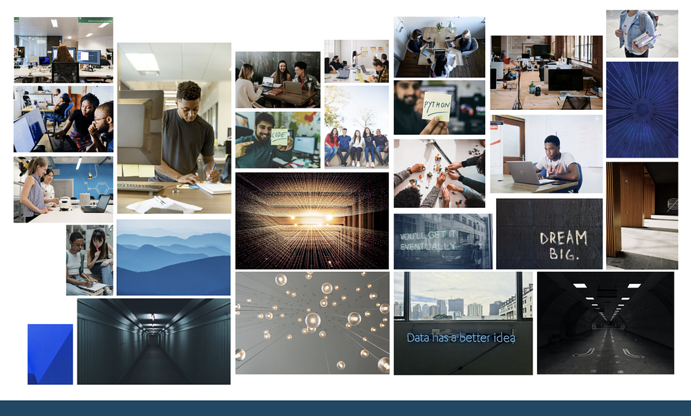
My next task was to create a moodboard to turn the keywords and phrases into visual images. I’ve really enjoyed building moodboards, I’ve realised that it can be whatever you make it to be as long as it makes sense to you.

From the Moodboard I created the tagline, ‘A Brighter Future’, which I think really echoes the fact that the charity is for underprivileged children who wouldn’t otherwise be able to have access to tech courses.
Sketching
After completing the moodboard I had a better sense of where I was going with the brand. I drew out three sketches for the different viewports (320px, 600px, 1200px) which were influenced by the general layout of the competitor screens with top navigation.
Building the composition for three viewports was quite challenging as it was something I hadn’t done before. I had read about the ‘Mobile First’ approach so I used that method and it seemed to work quite well.

Low-Fidelity
From the sketches I iterated to Low-Fidelity on Figma.
It was really important to get everything to Low-fidelity PLUS the text. This way I knew the length of space I needed for all the text I was using, it also meant that I wasn’t met with any surprises concerning space later down the line.
I wanted to learn from my mistake in previous projects where I totally underestimated how much space you needed for text and that whilst sketching was useful, it did not mimic the space needed in Figma.

Experimentation
Learning from some mistakes from my previous project, I experimented with my colours before diving into High-Fidelity. I took a frame and tested various colour/typography combinations to see what worked well and what clashed. I always wanted to keep in mind this idea of excitement and energy.
Typography
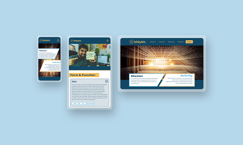
For the typography I was thinking about what environments typography looked exciting and thought about film posters and how action films give off an exciting, dramatic vibe. As a result of this I chose ‘Goldman’ as my main font for the headers. After showing Kim our instructor she said it was kind of like ‘Minority Report’ which I thought was quite cool (although kinda early 00s…)! Either way I liked it as I thought it was fun and I wanted it not to seem too serious. The main body text was Mulish.
Images
For the main hero image I chose this really cool photo of lights being dangled from the roof with a bright light shining through the middle.
I thought it symbolised code in many ways much like in ‘The Matrix’. Although it wasn’t code and it was in fact just lights I thought it looked really great and had a geometric, angular feel which related nicely with my two triangular shapes below

High Fidelity Prototype
Feedback
Overall I was really happy with the hi-fidelity version. I was happy with how the content shifted across different viewports as it made sense to add more content as I went up in size.
The feedback I received from people in the class was that it seemed a bit too ‘advanced’ for middle and high-schoolers which is a fair point.
The spacing looked consistent throughout the prototype which makes everything look really sharp. I realised from my last project that ‘if in doubt, add more spacing’ as it allows the content to breathe inside and makes for a much better reading experience.
Next Steps
- Add more fun and engaging iconography such as emoji’s in order to appeal to a younger demographic
- Consider adding more screens across the 3 viewports
- Test the prototype for more user feedback
Learnings
- Experimenting with colours and text is much easier to do on a blank frame before the content is in place. When I was fixed to a certain viewport I found it hard to experiment as I felt I was ruining what was already in place.
- When creating low-fidelity digital wireframes, it was much easier to get a sense of the length of the screen when all the content was in. In previous projects I found I was under-estimating how much space was needed for various pages.
