It’s Bumble, but it’s not romance we offer here…
An exploration into adding an additional fitness feature for Bumble

Introduction
As part of the UX Design program at General Assembly, I worked on a group concept project in a team of four. The design sprint lasted two weeks.
The Team
Aaliyah Rasuli, Raul Menegetto, Deborah Perera, Nico Wiggin (Me!)
The Brief
The brief was to explore the possibility of adding an additional feature to Bumble’s existing offering. Bumble currently have three products; Date, Bizz and BFF. As a group, we were tasked with adding an additional feature named ‘BumbleFit’ that allowed people to find exercise partners.
UX Skills
Double-Diamond Process
Discover: Project Canvas, Competitive Analysis, Survey, User Interviews
Define: Affinity Mapping, Experience Mapping, Empathy Mapping, Persona
Develop: Design Studio, ‘How Might We’, Moscow Analysis, Scenarios, User Flow, Wireframing, Sketching, Prototyping, Testing
Deliver: Visual Design, Style Guides, 15 minute Presentation
Platforms
Figma, Notion, Trello, Miro, Sketchbook, Marvel, Zoom (a lot)

Research
Before we dived into the research we dissected the brief to get to grips of the scope of the project and what was required. We did this by using a Project Canvas, this really helped unpick any assumptions we may have had or what risks could be associated with going down a certain route.
As we were doing it, we hit our first mini-problem, and that was that everyone was already coming up with design ideas including fonts, colour palettes etc. In order for everyone not to get too ahead of themselves I included a ‘Feature Parking Lot’ on the project canvas, this allowed us to park any potential ideas we had during research. We could then revisit them when it came to deciding on features. I wanted to make sure that we conducted extensive research FIRST so we didn’t fall into the classic error of designing for yourself as opposed to the user. Anyway, the first thing on the research agenda was to get a survey out and also to start looking at competitors.
As it was all of our first group project we were struggling on how to divvy up the initial tasks. We wanted to make sure we were being efficient with our time so we decided to split into 2 groups — Raul and I looked at brainstorming the survey whilst Debbie and Aaliyah looked at competitors.
Competitive Analysis
For the competitive analysis, first thing we wanted to clarify was if anyone was doing something similar. As a Fitness enthusiast, I was aware of the big fitness apps such as Strava, Garmin etc. but I wasn’t sure if any apps directly connected people 1-on-1.
We split the competitors into three groups; Fitness, Networking and Dating. As seen in the slide below we probably looked at too many direct fitness apps as opposed to focusing on how brands were connecting people together online.
The key takeaways from the competitive analysis were;
- All competitors had a customisable profile page
- Route Activity/Recommendation was not a tailored or bespoke service on Fitness apps
- Connecting Social Media profiles was a key feature i.e. Instagram to Hinge
- ‘Swiping’ left-right was the common way in which people approved/disapproved of people on dating apps

Understanding BumbleFit’s Brand Identity
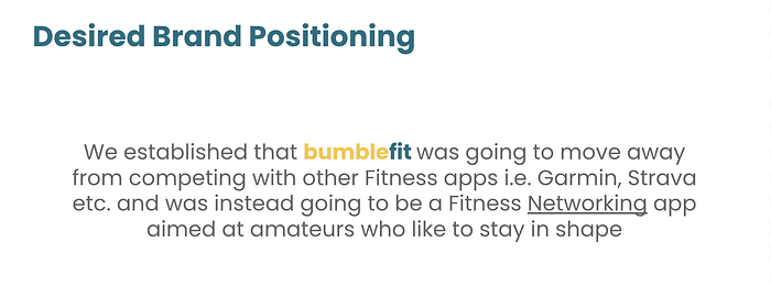
After completing the feature analysis on the competitors we felt we were getting lost as to who BumbleFit were and what audience they should be reaching out to.
To understand BumbleFit’s desired brand positioning we identified where we thought they should place on a matrix that considered;
A) Target user’s being either highly experienced (professional) or low-experience (amateur)
B) The function of the app — was it a performance app where you could track your data or was it a social networking app?

As you can see from the diagram we placed BumbleFit in the lower-right quadrant where they feature alongside Hinge. We wanted BumbleFit to be for amateur athletes looking to network with like-minded people.
Survey and User Interviews
The survey was a great way to obtain quantitative data on people’s fitness habits. We wanted to ask open questions such as frequency of exercise, where they exercise and who they exercise with. As Bumble was primarily a romantic dating app we made sure we asked how people felt meeting up with people online.
Here are a few key takeaways;
- Strava was the most popular app (80%) in the market
- 60% prefer to exercise outdoors
- 6.5% exercise to meet new people however 35% exercise with friends
- 85% exercise alone
As BumbleFit allowed people to connect with other people they didn’t know, we wanted to know if people were not exercising with new people out of choice or if there wasn’t a service that facilitated something similar.
User Interviews
We took these insights and conducted 12 in-depth interviews from the survey respondents. The interview scripts split the questions into three different sections;
- Views towards Fitness and getting to know their habits and behaviour
- Attitude towards meeting people online i.e. Dating, MeetUps etc.
- Thoughts towards a Fitness Networking app and how it might work
After distilling all of the findings from the User Interviews, we affinity mapped them on Miro to identify trends and common themes. The five main areas were as follows;
- Apps such as YouTube & Instagram are used for exercise inspiration
- Strava is really good for logging and recording activity but it can quickly get very competitive
- Group activities are very popular as exercise is all about community and being motivated
- 1–1 dating can often be awkward, activities can often help alleviate this awkwardness
- People are more likely to connect online once they establish a common interest

Persona
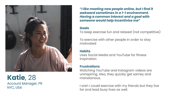
Building a persona allowed us to distil all of our findings from our user interviews and the survey into a simple, humanised person. That way we could always return to our persona to identify with our target audience. So, without further ado…
Meet Katie! She’s 28 and has just moved to New York. She likes exercising as it’s a great way to destress, she prefers exercise when it’s not competitive as she’s happy just looking after both her physical and mental health without the added pressure of competition. She uses YouTube and Instagram for fitness inspiration because its free and easy to use. She likes meeting new people online as she’s a bit of an extrovert, although she can find it awkward when in a 1–1 environment. With experience in online dating, she finds that having common interests is really important when meeting someone online.
Experience Map
To understand and empathise with our users, we took our persona, Katie, and mapped out a typical experience when using apps/websites such as YouTube and Instagram when finding exercise inspiration.
The experience see’s Katie getting excited about exercising after a long day at work. She then researches what classes to do online. This process can often take quite a long time. Once she’s completed the exercise class from YouTube she feels great as she’s done some exercise. However, she quickly begins to feel bored and un-motivated by the pre-recorded lessons.
We identified two key areas where we could help Katie.
- The pre-exercise ‘Research’ phase where she is deciding on what exercise to do
- The post exercise feeling of being unmotivated as she has no relationship with the pre-recorded exercise class

Problem Statement
“Katie needs a way to match with the right person of her desired skill level and interests so that she can be motivated and incentivised to stick to her new, healthy routine”

Design Studio
From the Problem statement, we ideated two ‘How Might We’s’ to take into the design studios. How Might We’s are a great way to get thinking how we might be able to solve certain problems for Katie.
How Might We…
- “… motivate users to connect with people they haven’t met before”
- “… incorporate group exercise into the Bumble dating model”
#1 Results
Sign Up page — When the user signs up to Bumble Fit they can select their interests, both fitness and personal, experience level etc. That way Bumble could match Katie with people with similar interests and a similar level of experience.
Match Page — When Katie is ‘swiping’ who she wants to match with, it comes up with results that they have entered in the sign up page. It also has ‘fun prompts’ that show that person’s greatest achievements, favourite music genre to exercise to etc.

#2 Results
The ‘Hive’ or Discovery Page — Bumble don’t actually have a home page so we thought to incorprate a discover page where users could find local groups, events, instructors etc. It would run alongside the 1–1 option that Bumble is known for.
‘Suggestion’ Pop-up — In the chat function, users could click on suggestions for tailored options in the local area based on the two people’s interests.

App Map
From the design studio we had an idea on the overall taxonomy of the app. Dating apps are typically pretty straightforward and don’t necessarily have ‘feature overload’ so we could be pretty minimal in our overall offering. Bumble have a lower navigation bar with the main option of the 1–1 dating, matches/chat page and then a profile page to edit + settings etc. With our ‘Hive’ idea we had to add in an additional option into the lower nav. The Notification and settings would then sit outside of the lower navigation.

Scenario
Katie is already an existing bumble user, she’s heard Bumble have brought out a new product called bumblefit. As she’s interested in fitness, she goes onto the app to help find a fitness partner of a similar level who can help motivate her.
User Flow
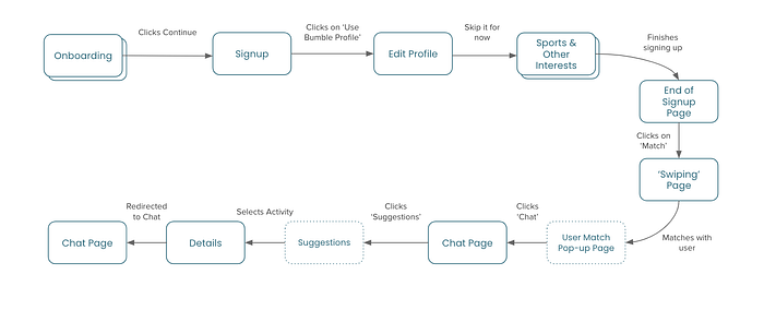
Taking our scenario, we put together a user flow based on Katie’s first experience using the new BumbleFit feature. As Katie was an existing Bumble user she didn’t have to do the account registration process as her details were already saved. The flow took into account all the steps Katie needed to take to match with a fitness partner with similar interests from, onboarding, sign-up, matching with a fitness partner and then into the chat where they make plans on what activity to do.
As we had sketched out the screens, we found it easier to visualise the flow in a wireflow.

Feature Prioritisation
Before we begun sketching as a group, we made sure we had all of the features laid out. To do this we plotted a feature axis and worked out what was essential and what level of effort each feature required. If you rewind, this is where we incorporated all of the features we had ideated in the beginning before starting research.
It was interesting as a lot of our initial assumptions did actually make it into our prototype.

Testing
We built three separate prototypes ranging from Low-Fidelity to High-Fidelity. The paper prototype in the beginning proved to be helpful in clarifying our understanding of how the flow would work however it was less useful in testing with people outside of the class as they didn’t understand elements on the screens. We all found ourselves having to jump in and explain certain areas where test candidates didn’t understand.
There were four main areas where we had issues on the user flow.
- The Sign-Up page
- Discovery ‘Hive’ Page
- Chat Page
- Suggestions pop-up
1. The Sign-Up

Problem
- ‘Experience level’ could have meant multiple different things and apply to different sports. For example, one could be good at running but bad at Tennis — how could we change this?
- We also found that ‘Distance’ was ambiguous as it could mean running distance or proximity to location.
- ‘Fun Prompts’ was confusing — users didn’t understand the point in the non-fitness related questions
Solution
- We tidied this all up in the mid-fidelity prototype by allowing users to change their experience level in an ‘add sports’ option. This would allow users to be more specific with their sporting experience level.
- With the ‘Distance’ problem — we changed the phrase to ‘Comfort Zone’ — this would allow users to set their relative comfort zone so they could be pushed to a similar limit
- We included fitness-related prompts related to some of the user interviews. Asking questions like, ‘What’s your favourite music to work out to?’, ‘What’s your greatest fitness achievement?’
2. Discovery ‘Hive’ Page

Problem
We initially intended to use the ‘Hive’ page as the landing page once users had completed the sign-up process. When testing the product it was apparent that users were unsure on where to go once they had arrived on the page. Whilst the page was well-received in terms of content they just weren’t sure on where it fit within the flow.
Solution
We removed the Discovery page from the ‘happy path’ as it didn’t fit in the user flow. In our next steps we will look to include an additional flow where Katie can find groups or instructors within the area.
3. Matches & Chat Page

Problem
Users were pretty confident in understanding the chat page as they are very common in most apps. We wanted to design it as close to the Bumble chat page as possible to keep consistency. The problem we had was again around the flow of the screens from ‘matching’ with someone to then chatting with them. It was quite a clunky process of going from the match screen → matches → chat page. Users preferred to go straight through to the chat page once connecting.
Solution
We removed the ‘matches/conversations’ page from the existing flow. Once the user then connected with someone they would receive an option of either to ‘keep swiping’ or to chat directly. That way the matches page wouldn’t appear in the initial ‘matches’ process and could instead sit in the lower nav bar when the user wanted to access it.
4. Suggestions Pop-Up

Problem
From the initial low-fidelity design, the suggestions page changed quite a lot. Users questioned the ‘vote’ concept where we thought about gamifying the activity that Katie and her match can go and do. We realised that this didn’t really work in a 1–1 environment as the vote would be 50/50.
Users also didn’t like how there was a ‘Can I help’ chatbot feature in the middle of the text, it felt intrusive.
We thought about adding a map so Katie could find activities based on the pair’s location. This didn’t really work in a quick pop-up so we moved it to the ‘Hive’ page.
Solution
Instead of having a pop-up that intruded on the chat page, we included an optional ‘suggestions’ button in the chat header. This way users could click on it if they wanted to.
The options in the pop-out would feature two bespoke activities based on the users shared interests. In this case it’s Pilates as both users said they liked Pilates in the sign-up process. In the bottom option you’ve also got local groups in the area should they not want to meet 1–1. This relates back to the user research findings that Groups were very common.
Updated User Flow
Once we had completed all the tests we amended the user flow to reflect the updated journey. We then implemented all of the findings into a Hi-Fidelity prototype.

Visual Design
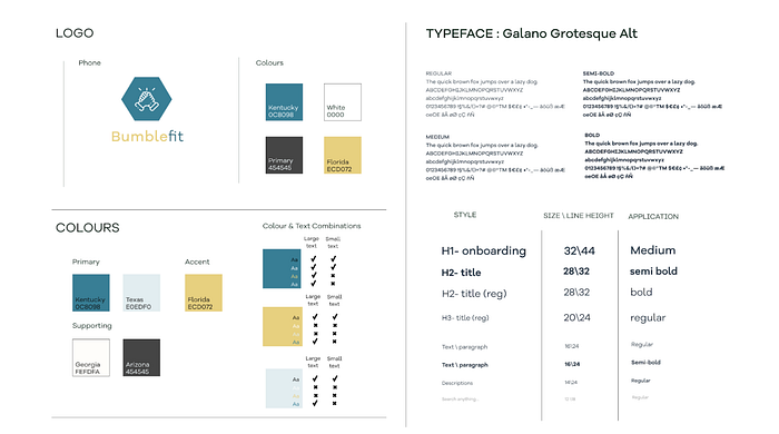
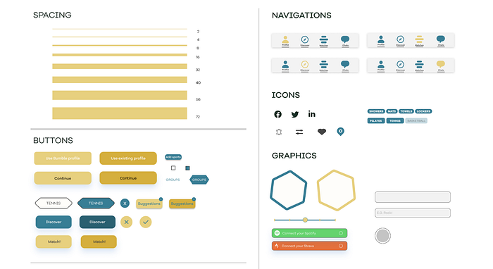
As it was a concept project for an existing brand we had to keep the UI as consistent as we could with Bumble’s products. Bumble’s other three products had their own brand colour so we wanted to give BumbleFit it’s unique identity. We choose a blue/green colour that reflected an outdoors-y feel to it.


Style Guide
Final Prototype
Before the ‘big reveal’, here is a quick recap of the scenario:
Katie is already an existing bumble user, she’s heard Bumble have brought out a new product called BumbleFit. As she’s interested in fitness, she goes onto the app to help find a fitness partner of a similar level who can help motivate her.
**For the purpose of the run-through — we have included the Discovery ‘Hive’ page as part of the flow**
Next Steps
- As we only designed the ‘happy path’ for Katie, we would look to design an additional flow for Katie to find a group or an instructor via the Discovery page
- Explore a second Persona — more competitive athlete looking to find similar-experienced athletes
- Add a paywall (Go Premium/Gold). As Bumble is a free service we would look to add a paywall to introduce additional revenue streams. Alternatively we could look to see how events or gyms could pay for promotional posts within the discovery section.
- Accessibility assessment (colour blindness, temporary and permanent disabilities, etc.)
Learnings
- Group projects need a facilitator. This was my first experience working in a group design sprint. I felt we went out of the blocks so quickly and got ahead of ourselves. We hadn’t officially organised a facilitator so we had little direction for the first couple of days. I felt that I naturally took on that role as I like project managing and working with other people’s skillsets. I learned that I really liked the facilitation process as it allowed me to get involved and direct the group.
- Sometimes the simplest solutions are the most effective. Our design wasn’t the most extravagant nor groundbreaking but it was easy to understand and test candidates said they really needed something similar which was very positive.
